This is a web page based on a talk given by Don Hopkins to BayCHI, October 13 1998, at the
Xerox PARC auditorium.
Copies of the Pie Menu Video
shown at the talk are now available!
Pie menus are a naturally efficient user interface technique: directional selection of pie slice shaped targets. The cursor starts out in the center of the pie, so all targets are large, nearby, and in different directions. Fitts' Law explains the advantages of pie menus, relating fast selection speed and low error rate to large target size and small distance. Pie menus are easy for novice users, who just follow the directions, and efficient for experienced users, who can quickly "mouse ahead" once they know the way.
The practical development and evolution of pie menus has been driven not only by scientific theory and experiments, but also by practical first hand experience using pie menus on a regular basis, and applying them to real world products.
User interface design is not so much a process of raw artistic creation, nor the legalistic application of interface guidelines and theories, but more like the exploration and discovery of naturally efficient ways of solving problems given particular sets of constraints. The outcome is different every time because the constraints always vary, but some of the underlying principles are universal. Doug Engelbart believes very strongly that the human-tool co-evolution should be based on rigorous exploratory use in a wide variety of real-world applications.
Don Hopkins will discuss the design of various real- and not-so-real-world applications he's developed with pie menus, from his first X10 window manager 11 years ago, to his latest game at Maxis, "The Sims".
Don Hopkins has been researching and programming alternative user interfaces across various platforms in different tongues, including Forth, PostScript, Lisp, and ScriptX, and lots of obscure special purpose extension languages. His interests include cellular automata, visual programming, user interfaces, games, networking, real time graphics, toolkits and window managers, object oriented programming, distributed objects and hypermedia, artificial intelligence, reading and writing code, and applying the works of Philip K. Dick and Stanislaw Lem to software design.
Don has worked as a migrant research programmer for the University of Maryland Parallel Processing Lab, Heterogeneous Systems Lab, and Human Computer Interaction Lab, as well as The Turing Institute, Carnegie Mellon University, Kaleida Labs, and Interval Research Corporation.
He's also worked in the real world as a software developer, programming an Open Look NeWS toolkit in PostScript for Sun Microsystems, porting SimCity to Unix and adding multi-player collaboration for DUX Software, developing a real time visual data flow programming language for Levity and Interval, creating a visual NeWS programming environment for HCIL and Grasshopper Group, and hacking Gosling Emacs for UniPress Software. He's currently working at Maxis on a family simulation game designed by Will Wright.
Note: if you are interested in a copy of this video tape, plus an instructional demo of ActiveX pie menus, please order the Pie Menu Video.
0:30 Introduction
0:50 Forth X10 Window Manager
0:36 NeWS 1.1 Lite Window Manager
0:28 NeWS 1.1 Mousee
1:00 TNT 3.0 Pie Menu Tabbed Window Manager
0:30 SimCity Introduction
4:44 X11 SimCityNet Demo
1:15 HyperLook SimCity scrolling and zooming
1:12 HyperLook Components
0:55 Emacs Color Menu
0:43 NeWS Font Menu
0:42 Precision Pie Menu
0:23 Scrolling Spiral Pie Menu
3:35 Regret
10 minute live demo of ActiveX Pie Menu
10 minute live demo of The Sims
+ 0:50 -- Forth X10 Window Manager. Mouse ahead with up/down/left/right menu.
"I'll show you mouse ahead. The push menu is very easy to select the direction you want very quickly. So if you mouse very quickly and the events are already in the queue by the time the program sees them that will complete the selection there is no need to actually put up the menu. So I'm going to select a whole bunch of rights, in succession. Now, a whole bunch of lefts. [Terminal window beeps with talk request.] Oh, I'll deal with that later. [Use pie menu to iconify then lower the offending terminal window.]"
+ 0:36 NeWS 1.1 window manager, with mousee and world map window.
"These menus here are very easy to use with mouse ahead, and since the window manager is something you use a whole lot, it's really good to optimise it to use mouse ahead. Now, I'll demonstrate mousing up, and down. Now, as you can see, this pac-man flashes on the screen really fast when I've made a selection fast enough that the computer can't keep up with me. But the mousee menu displays the actual menu here, although it was never mapped on the screen. It's just using a very cheap form of feedback, just to give me some form of confirmation."
+ 0:28 NeWS 1.1 Mousee
"So, after using this for a while, it becomes very gestural, and very unconscious."
+ 1:00 TNT Pie Menu Tabbed Window Manager
"Now you can press the right button to pop up a pie menu on the tab or the frame itself. And that has commonly used commands like front and back in mnemonic directions. Back is down and front is up. When you make a menu selection by mousing ahead, it doesn't display the menu. As long as you're moving it supresses the menu display. And it gives you feedback on the overlay plane of the slice that you're in and the label of that slice, so you can actually see what you're going to get before you choose it, without even seeing the menu itself. And when you wait, it pops up the menu, once you stop moving. So if you waste some time by just waiting around, it will waste a bit more time by giving you some stupid animation. This is meant to be negative reinforcement, to encourage you to mouse ahead."
+ 4:44 -- X11 SimCityNet Demo
[Music is 50 or 51 beats per minute. 50 beats / 60 sec = 5/6 beats per sec, beat = 6/5 sec long, so round down to 1 beat per sec for slack.]
"Skywatch One reporting heavy
traffic."
I'm Don Hopkins from DUX
Software, demonstrating multi user SimCityNet
for Unix, running on X11 on
an Indigo workstation, based on the original SimCity by Will
Wright from Maxis.
"Skywatch One reporting heavy traffic."
[6 beats to talk]
On the left is an overall map window, and on the right is a
close-up animated view. You can pan the animated view around, by
dragging the yellow rectangle on the map. Then you can edit ...
"Rumble, crash!" (Destroy a building with the
bulldozer.)
... with the bulldozer, and build...
"Residential." (Select the Residential zoning icon
from the pallet, and zone some land.)
"Skywatch One reporting heavy traffic." (Oh no, that
helicopter won't shut up!)
You can pan by dragging the middle button, directly, without
moving to the scroll bars, which don't exist. And you can select
from the pallet of editing tools, by pressing on the icon...
"Road." (Select the Road building icon from the
pallet, and make some roads.)
"Wire." (Now string some electrical wires to hook up to
the power grid.)
"Police Station." (Keep the donut shops in business.)
Or clicking the right button, and popping up a pie menu.
[13 + 19 + 27 = 59 beats till next voice (1 min)]
(Check out my Pie Menu
Page, for more information about pie menus!)
"Whoosh! Zone? Fire Station." (Press the right mouse
button to "whoosh" up a pie menu. Select the Zone
submenu, then select Fire Station icon from that.)
"Skywatch One reporting heavy traffic."
"Whoosh! Wire."
"Whoosh! Bulldozer."
"Crash, crash, rumble, crash!"
[27 beats to talk]
"Skywatch One reporting heavy
traffic."
"Whoosh! Zone? Industrial."
"Whoosh! Bulldozer."
"Rumble, rumble, rumble!"
[19 beats to talk]
"Skywatch One reporting heavy
traffic."
"Whoosh! Build? Nuclear Power."
"Whoosh! Road."
"Whoosh! Wire."
[13 beats to talk]
Pie menus work with mouse-ahead. If I remember
the direction, I can press down, move, and release, to select
without showing the menu.
"Whoosh! Road." (No pie menu appears on the screen,
but we hear the feedback and it selects the icon!)
"Whoosh! Rail." (See, easy!)
"Whoosh! Bulldozer." (Believe me, you get used to it!)
[4 beats to talk]
Or I can always pause, to see ... the menu.
[18 + 9 + 24 + 4 + 19 + 11 + 9 + 24 = 118 beats till end (2 min)]
"Whoosh! ... Road." (You can always see the menu if
you need to.)
"Whoosh! Zone? ... Fire Station."
"Skywatch One reporting heavy traffic."
"Whoosh! Bulldozer."
"Rumble, crash!"
"Whoosh! Zone? Industrial."
[18 beats to talk]
(Pan on over to the Panhandle, in Haight
Ashbury, east of Golden Gate Park.)
"Whoosh! Bulldozer."
"Rumble, rumble, rumble."
(Clear away some park in the Panhandle.)
[9 beats to talk]
"Whoosh! Road."
(Fix up the part of Oak Street that we accidentally destroyed.)
"Whoosh! Zone? Residential."
(Put down a residential zone in the park.)
"Whoosh! Wire."
(Wire the new zone onto the power grid.)
"Whoosh! Zone? Park."
(Put park land back down around the residential zone.)
"Whoosh! Zone? Residential."
(Put down another residential zone in the park.)
"Whoosh! Zone? Park."
(Put more parks around the new zone.)
[24 beats to talk]
"Whoosh! Rail."
"Skywatch One reporting heavy traffic."
(Put a railroad down along the north edge of park next to Fell
Street.)
(The train appears and starts heading down the railroad, as it's
being drawn.)
(Oh no, we're missing one piece of rail because there was a
fountain in the way!)
(The train is heading for the fountain! Quick, pie menus to the
rescue!)
[4 beats to talk]
"Whoosh! Bulldozer."
"Rumble, rumble."
(Bulldoze the fountain out of the way.)
"Whoosh! Rail."
(Put down the rail just in time, right under the wheels of the
oncoming train!)
"Whoosh! Rail."
"Whoosh! Bulldozer."
"Rumble, rumble."
[19 beats to talk]
"Whoosh! Rail."
(Make a little maze of railroad tracks to keep the train busy
while we bulldoze another couple of fountains and lay down the
rest of the track.)
"Whoosh! Bulldozer."
"Rumble, rumble, rumble, rumble!"
"Whoosh! Bulldozer."
[11 beats to talk]
"Whoosh! Build? Airport."
"Whoosh! Oop."
(Build an airport in the middle of the Panhandle.)
[9 beats to talk]
"Whoosh! Road."
(Build an access road to the airport from Fell Street.)
"Whoosh! Bulldozer."
"Whoosh! Wire."
(Hook the airport up to the power grid.)
"Whoosh! Road."
"Whoosh! Zone? Park."
(Airport's radar starts spinning, as the train rolls back down
the track.)
[24 beats to talk]
+ 1:15 HyperLook SimCity scrolling and zooming
"Here we go. Ok, this is, uh... We can drag. This is the
overall map view, and this is the editor. And I can drag this
rectangle around to scroll the map, and then I can throw it, and
it has some inertia, so it bounces around.
And then with this zoom button here I can zoom my view in to
look closer and closer into the map, so that we're actually
scooting around quite close to the city. And then we can actually
edit in this scale. Wee! Put some roads down. I think you can get
even closer.
And then you can zoom out. So all this is written in PostScript. All the graphics, the SimCity engine is in C, but all the user interface and the graphics is in PostScript. Now the neat thing about doing this in HyperLook is that HyperLook is kind of like HyperCard, in that all the user interface is editable. So these windows were're looking at here are like stacks, that we can edit. Now I'll flip this in edit mode while the program is running, that's a unique thing."
+ 1:12 HyperLook Components
"Ok, now. This is showing us something's happened, and I can click in here to bring my other view there. The neat thing is this view here itself is just a user interface componenet. And I can copy and paste that and have multiple views, each one of these. Once I've made one, I can put them anywhere. This window right here. You can click here to get three of them! You put this nice high level component into this user interface system, and now anybody can just cut and paste it.
One of the neat components that HyperLook comes with is the
graphics editor, which is pretty ubiquitous. Like if I were to
edit this. If I hit the properties key on this button, I get a
property sheet that has a graphics editor in it. Ok, now this
property sheet itself is a stack that I can edit. So my graphics
editor, the menu here, and just all this stuff is fair
play."
+ 0:55 Emacs Color Menu
"Now I'll select a bright paper color by pulling all the way out, and when I click the button, it pops up a hue/saturation submenu. Now, the hue is the direct, and the saturation is the distance I move out, so as I move around this, it shows me the color I've selected in the menu center."
+ 0:43 OpenWindows Font Menu
"Now, I move in one of the directions to select that style, and the distance that I move selects the point size of that font. So as I move in and out, the point size changes, and is displayed in the menu center."
+ 0:42 Precision Pie Menu
"If you want to input an exact number like an angle, you might want to get it down to a certain number, but you run out of screen space before you get enough leverage to change the number to what you want. So what happens here is that when you poke out, it makes a flexible lever, that the further out you go, the more flexible it becomes, so you have much finer control over the number. So as I move around back in and out, I'll poke it into a different place, and just come out further to get a lot of leverate, and dial exactly the number I want."
+ 0:23 Scrolling Spiral Pie Menu
"So, what this menu is, is a scrolling, a spiral pie menu, that only displays a maximum of 8 items. And you can scroll to more items by spinning the cursor around the center of the menu. And this little graphic here tells you that there are more items clockwise or counter clockwise."
+ 3:35 Regret
Reagan Bites
Giant Pie Menu, Pac-Man eating windows.
PSIBER, Emacs, and Pseudo Scientific Visualizer, editing
PostScript code. Transparent Visualizer window.
Debug breakpoint in PostScript code, load stack, open and browse
objects, manipulate stack, push object with pie menu, type
commands
Small view of ARPANet map, tree structure view of a network. Imps
connected to each other
Pseudo Scientific Visualizer view of the same ARPANet map. Open
new visualizer. Pop up pointing hands.
Scientific experiments comparing pie menus and linear menus.
Callahan, Schneiderman, Weiser and Hopkins. 8 item pie menus were faster and more reliable than 8 item linear menus. Diagonal items were slower than vertical and horizontal items.
Kurtenbach and Buxton compared different numbers of items. 8 items were faster than 7 items!
The higher degree of symetry, the easier the menu is to remember.
Pie menus programmed directly into an application.
X10 "fuwm" window manager & forth system. Used to perform experiment. Let users define their own pie and linear menus in a weird language. Linear menus could pop up pie submenus and visa-versa.
Mark Weiser's SunView SDI pie menu. X11 "piewm" window manager.
PostScript pie menu pictures.
NeWS pie menu class had same API as linear menus, and could replace the default menu class, rendering all menus in the system as pie menus. You could dynamically switch menu styles.
Problems with big ugly menus not designed to be in pies, that would be a lot nicer and easier to use with just a few changes. Partially the fault of the pie menu implementation for not being robust in the face of many items. And partially the fault of the system for not being user reconfigurable enough.
On the other hand, HyperLook allowed users to reconfigure their menus by going into edit mode (like HyperCard) and bringing up a property sheet on the menu that allowed them to change and rearrange the items.
Separate menu actions are the key to making menus robust against user reconfiguration. The program cannot depend on the order or the presence of the menu items, but each item has a unique action key that drives the program.
Like the Gosling Emacs pie menus, that assigned a virtual function key for each menu item, that allowed you to use menus in keyboard macros, and get help on menu items like any other keyboard command.
TCL/Tk pie menu widget. Image items. Mimally shaped window. Audio feedback.
Window management (moving, resizing, opening, closing windows).
Program management (running different programs on different network servers and the local workstation).
Hypermedia browsing and authoring (next, previous page, up to index, down to contents, define link, follow link, edit, create link, create document, etc).
Emacs pie menu compiler, that translated Info menu trees into pie menu trees, bound to virtual function keys.
Font selection pie menu, direction is style, distance is pointsize, real time visual feedback in menu.
Color selection pie menus. Distance is brightness, submenu direction is hue, distance is saturation.
Also one color pie menu with brightness ring around outside, and hue and saturation field inside. (ddj article)
Visual PostScript programming environment. Data editing, view controls, function invocation.
Graphical editiors, word processors, authoring tools.
Hyperlook component. Property sheet with editable list of menu items and controls to edit style.
SimCity tool selection. (HyperLook edition, as well as multi player X11 edition).
TCL/Tk pie menu widget. Still required integrating C code into your application. Not easy enough for most software developers to incorporate into their applications. OLE aka ActiveX is finally mature enough to support plug & play components.
Show short video clips: X10 window manager, NeWS window mnager, NeWS lossenge demo, all the widgets demos, emacs font and color menus, hyperties, psiber, hyperlook simcity.
Show 5 minute video tape of X11 SimCity pie menus in TCL/Tk.
Pie menus on the right button are used to select the SimCity editing tool, that's used with the left button. The middle button pans by dragging the image under the cursor, like the PhotoShop hand.
Pie menus are a shortcut for the tool pallette, which can be hidden, to devote more screen space to the city view.
Tool pallette can be hidden, to devote more sceen space to the city.
Icons on pallette and pie menus identical.
Layout of pallette reflects arrangement of pie menus, so pallette functions as a "crib sheet" for the menus.
Icons show colored tile cursor outline around them, coded with solid and dashed lines relating to the tool. Road is black and white, rail is black and brown, park is green, Industrial, Residential, and Commercial are the same colors the game uses: yellow, green, and blue. So the cursor shows where the tool will draw, as well as a color code for which zone will be drawn. Cursors are different sizes for the different tools, small park, medium industrial, large stadium, huge airport. Pallette serves as a cursor legend, which is useful in multi player mode when you can see other people's cursors.
Audio feedback. Speak menu label, when cursor selects slice. Announce submenus in rising tone, "Zone?", to create tension, and announce top level items in lowering tone, "Industrial.", to resolve tension.
Editing tools have a vocal sound, voul and pitch reflects position in tool pallette and price. Higher pitch is higher in the pallette and cheaper, like roads and parks, and the lowest pitch is the huge bottom airport. Left to right are represented by three different voul sounds, "ee", "uh", "oh", which are played at different pitches for different tools.
Multi player voting on important issues and expensive zones.
Voting dialogs require unanimous vote of all players to do important things like change tax rate, build expensive buildings, quit the game (although anyone can quit themselves, everyone must agree to shut the whole game down). Any person can dissent by pressing cancel button. OK button requires each person to press it. The beveled edges are extra thick: as many times thicker than usual, as there are yes votes required. As each person votes "yes" it lowers one normal thickness down deeper, until the last vote fully depresses it.
Bouncing building gets closer to ground as more people vote for them., Finally falls "down to earth" as the last person votes for it. Any person can cancel a vote since they require unanimous consent. Bouncing buildings also display a parallel multi player voting dialog, and the bouncing building is a shortcut to the dialog. To vote yes, you just place the same building in the same place. To change the proposed location, you place the same building somewhere else, and it resets to only having your vote.
Using pie menus to select editing tools works very well, because it saves you the effort of moving the cursor to the rool pallette, and then back to where you were editing. Locality of reference. You are usually working in one area, so you want to stay there and switch between tools, and not have to run back and forth all the time.
Very reliable since changing modes is not a consequential command, you can undo the effect of a mistaken command by just doing the right command.
Pie menus that invoke consequential commands like "quit" or "save" that can't be undone, should not be top level menus, since they would be too easy to select accidentally. Possible to pop up another "yes/no" confirmation pie submenu, or bind commands menus to small buttons instead of large areas.
Pie menus are best for static menus that a user interface designer has made an effort to arrange optimally. Not so good for selecting dynamically generated options.
Tool pallette look like a "Totem Pole" or "Snow Man", because the icons are differently sized and grouped, to reflect the layout of the pie menus. This is good because it makes them easy to recognize, like we read words by the outside shape of the letters.
Residential, Commercial, Industrial: Medium sized, tall icons. Important primary zones. Same color and ordering as used elsewhere in the game. RCI
Fire, Query, Police: Fire/Police balanced pair. Query commonly used, so it gets an easy to select direction: down. Query is free, so it has a small icon. Fire and police are square since they're not as important as RCI, so not distinguished by being tall.
Wire, Bulldozer: Very common. Top level menu. Upper diagonals. Cheap so small.
Rail, Road: Very common. Top level, horizontal axis. Long icons, invoking linear transportation, tiles that are put down in a line. Road cursor is black and white. Rail cursor is black and brown.
Chalk, Eraser: Pair of overlay drawing tools, for drawing on the map and communicating with other player. Lower diagonals. Free so small.
Park: Common, so easy up/down motion. Cheap so small.
Stadium, Seaport: Big, expensive, uncommon.
Nuclear, Coal: Big, expensive, pair of power plants.
Airport: Huge, very expensive, largest. Good solid base for totem pole or snow man.
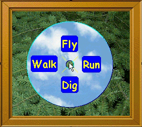
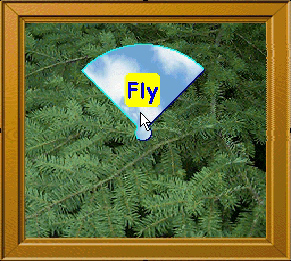
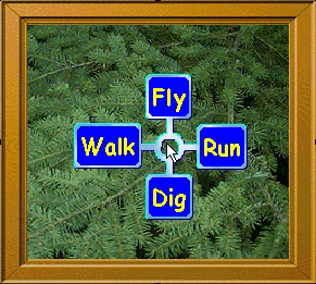
Introduce ActiveX pie menus. First, SHOW them! Web page with compass menu of demos. Use it to walk through the instructions.
Mouse control. Click-move-click. Press-move-release: "abbreviated".
Items shaped like pie slices. Center inactive. Cancel by clicking in the center.
Select by moving into a slice and clicking. Reselection by moving around before clicking.
Move out further for better control. All the way to the screen edge.
Nested menus. Browsing.
Mouse ahead. Click to pop up instantly. Press and move: doesn't pop up until the cursor stops moving, and never pops up if you select without hesitating.
Abbreviated gesture. Abbreviated feedback. Cursor feedback before popup, showing the slice that will be selected.
Previewing of selection results in the application view makes mouse ahead even better.
Mouse ahead through nested menus. Stop moving at any time and the pie menus pop up.
Nested menus. Tree of items. Any item can pop up another pie menu.
Users can go back to previous menus, or cancel entire tree, or select any item.
Submenus centered on cursor. Cursor returns to center before popping back. Demo reselect gesture.
Scrolling menus.
Limit the number of items to a nice even number like 4 or 8. So all 8 slices are wide and easy to select in different directions, while other choices can be selected by pointing directly at their labels.
Scroll pie menu up and down layers of 8 items each. Click in middle of layer to bring pie to that layer.
Number of menu items rounded up, to make it 4 or 8, so never have uneven number of items and odd angles. Preserve symetry.
4 or 8 item maps well to arrows and numeric keypad.
Forcing the menu on screen and moving the cursor to compensate for menu window delta. Demo screen edge conditions, as well as mouse and keyboard control interaction.
Keyboard controls.
Esc, Del: cancel entire menu tree.
Backspace: back to previous menu.
Home: center menu on cursor.
Arrows: top/buttom/left/right item. Press 2 arrows at once to select diagonal items.
Return: selected highlighted item.
Page Up, Page Down: scroll back and forth between layers.
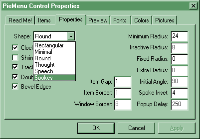
Robust. Supports a wide variety of uses and environments without crashing or becoming unusable.
Resistant to user mistakes and designer attention deficite. Forgiving. Good defaults. Supports wide range of usage scenarios.
Efficient. Lazy resource and cpu usage. Mouse ahead reliably.
Double buffering. Dynamic window shaping. Fancy options can be disabled.
Scalable. Supports any number of items, and any depth of submenu.
Not that it's a good idea to have too many items to nested menus too deep.
Two levels of eight items is the maximum ideal.
It would be horrible if the menus were unusable in the face of too may items.
Graceful degradation. Scrolling isn't a perfect solution, but it's better than the alternative. [See video tape with giant 360 item pie menu.]
Reading order is important so user can scan manu items and find them alphabetically, etc.
Hard for designers and users to cope with circular order, but it is convenient some times, if you can specify the initial angle and layout direction (cw, ccw).
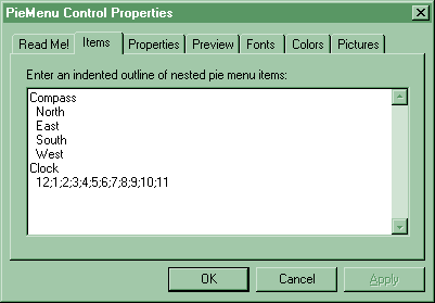
Support casual interface designers, web page authors, and application developers as much as possible, with good defaults, smart dynamic layout, and reconfigurable overrides and options. Previewing. EZML. Future: direct drag-n-drop editing of menus while they're popped up, ala Windows desktop. End user menu reconfiguration. Some menus can allow the user to add, delete, and rearrange items. For example, a hot list pie menu whose item actions are URLs. The user would want to but common URLs in easy to select directions, and group less common ones into submenus.
Support machine generated, dynamic menus. Not all menus are going to be well thought out and carefully arranged by a human. Any number of items may be present. Items have action strings that can hold a token for the program to process, instead of trying to interpret the label that the user sees. For example, the token could be the URL to link to, or the index of a month instead of the month name. The token makes the menu item self sufficient and allows the user to edit and rearrange items without confusing application.
Pie menus should not be ugly. Double buffered drawing option, that may be turned off to conserve memory. Support bitmap backgrounds, shaped windows (fast rectangle, round pie, though and speech balloons, bimap mask, etc), rounded corners, beveled edges around any shape, colors, fonts, various styles and values for the designer to play with and adjust to the situation.
Audience: User Interface Designers. Designer Interface Users. ... User Designable Interfaces.
Instant Gratification integrated over time => Continuous Gratification. Preview notification. Real time feedback.
Force Feedback -vs- Consentual Feedback.
Self Revealing, but not Exhibitionist. Display pre-emption.
Progressive Disclosure -vs- Consentual Feedback. Let the user decide how much to see.
Expert user has the option of abbreviated gestures and feedback.
Gestural, but not too "Hands On". Direct Manipulation can go too far.
Adaptive dynamic layout, reconfigurable styles.
Rounding up. Boosting the number of items up to 4 or 8 so it's even and symetrical.
Chunking down. Layering. Dividing the menu up into clusters of 4 or 8 that you can scroll between.
Keyboard control. 4 items <=> arrow keys. 8 items <=> numeric keypad.
Reading order layout (left to right, top to bottom) -vs- circular layout (initial direction, clockwise or counterclockwise).
EZML: Easy Menu Language. Nested menus described by an indented text outline.
Future: XML. Still support EZML mini-language, and editing through property sheets, but save and restore as XML.
Items have label and action. Action can be a token for the use of the application that the user does not see.
Future: items with images, animation, and nested components.
Pie menus present continuous direction and distance of selection to program to interpret as it wishes.
Event notification when cursor moves, selection changes, selection made, etc.
Complex regions can define popup window shape. Dynamically changing shape during tracking to show only selected item.
Beveled edges. General purpose region bevel function that can handle any shape window.
Submenu browsing. Mouse and keyboard controls. Back level. Cancel tree. Scrolling up and down.
Scrolling pie menus. DNA Helix. Zipper.
Discuss possible extensions to ActiveX pie meuns.
Full screen DirectX support: for use in games, etc. Implemented pie menu widget for Maxis's GUI framework for games. Games and high end applications demand custom user interfaces and tightly coupled data model & display feedback & input processing.
Graphical pie menus, created by artists as transparent bitmaps, who have complete control of every pixel on the screen. Pie menu code simply processes input and selects bitmaps to display. Cursor feedback and direct feedback through application view. See results instead of intermediate menu. Continuous gratification.
View control pie menu, for Zoom In, Zoom Out, Rotate Left, Rotate Right, and panning. Shortcut for control panel. Rotates and zooms around cursor position at view menu popup. Scroll by pressing and moving, click to pop up view menu. Tradeoff, since scrolling is so important.
Object moving and rotating tool. Pie menu cursor & immediate feedback, but no popup. Kung fu sound effects. Grid clicking. Rotate in place. Pick up, move, place and optionally rotate. Placement error feedback. Snap gridding if valid location. Sticky feel. Audio feedback. Sliding if invalid. Doesn't stick to grid. Slippery feel.
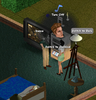
Action menus. Click on an object to pop up a menu of actions the currently selected person can do with it. That person's face is animated in the center. The face shows you who will perform the action, and it looks around at the items as you point at them, and nods to confirm selection.
Dynamic action menu items, that appear under the right preconditions, which is part of the game design.
The action menu casts a feathered shadow that desaturates, lowers the contrast, and darkens the live animated world behind it. So the labels and colorful 3d animated head show up distinctly against the otherwise cluttered background. The labels have contrasting edges, and they stick out over the soft edge of the shadow effect.
In game feedback. Custom 2d toolkit & 3d character animation & simulator integration. Render head in menu center facing camera. Desaturate background, clipped through z-buffer, with round feathered alpha blending. Draw menu items on top with high contrast font. Call back into simulator to dynamically score action menu items, in order to nod or shake head according to character's current opinion. Punched through several layers of abstration to implement this design.